

This is resource for students interested in advanced photography editing techniques who want to incorporate images into their writing in a course without a specific photography unit. Its focus is not on how to operate a camera or compose shots (the best source for that are Mike Browne’s guides here and here), but rather a guide to taking a RAW photograph and making editing choices in common software like Adobe Lightroom.
1. Define a purpose and commitments for editing.
So, you have a photograph that you want to edit. Start by defining what you hope to achieve by editing it.
- Do you have a look you want to create independent of how things looked when you took the picture?
- Or do you want to capture what it felt like to be there?
- Do you think the camera or the human eye sees the truth of the scene?
Your answers will shape how you edit. (If editing as a journalist, remember to abide by certain ethical principles.)
For me, I’m interested in verisimilitude: honoring the scene as I experienced it. This means balancing a commitment to what the technology saw with what I perceived. I won’t use AI to generate new picture elements, but I accept that my feelings when I took the picture will shape what I remember as true, and that editing is needed to transform what the poorer eye of the camera saw into the something resembling what the more advanced camera of the eye saw.
2. Decide what story the photo can and should tell.
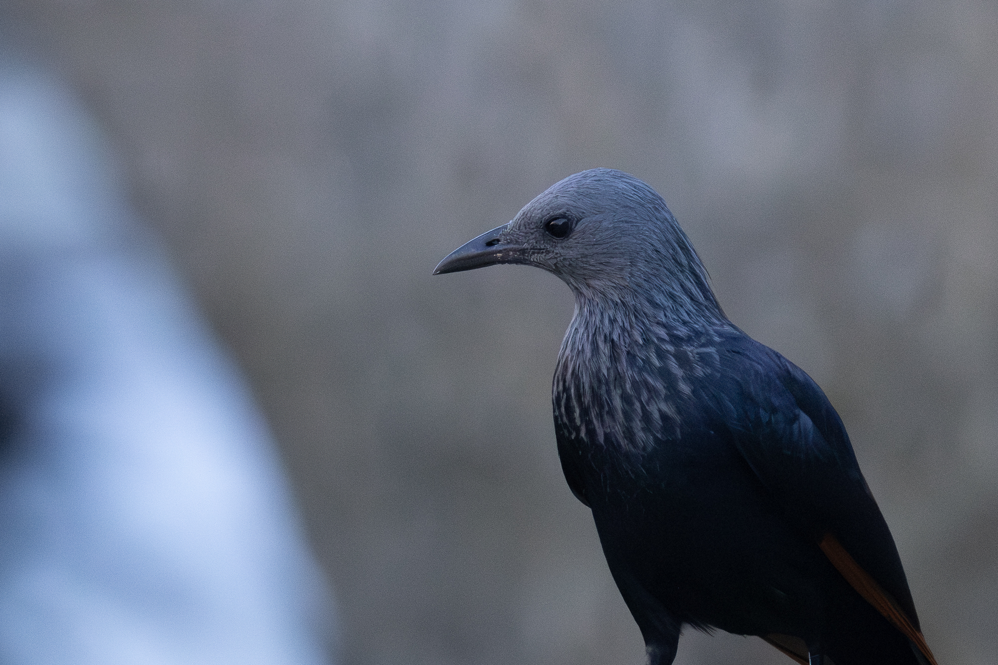
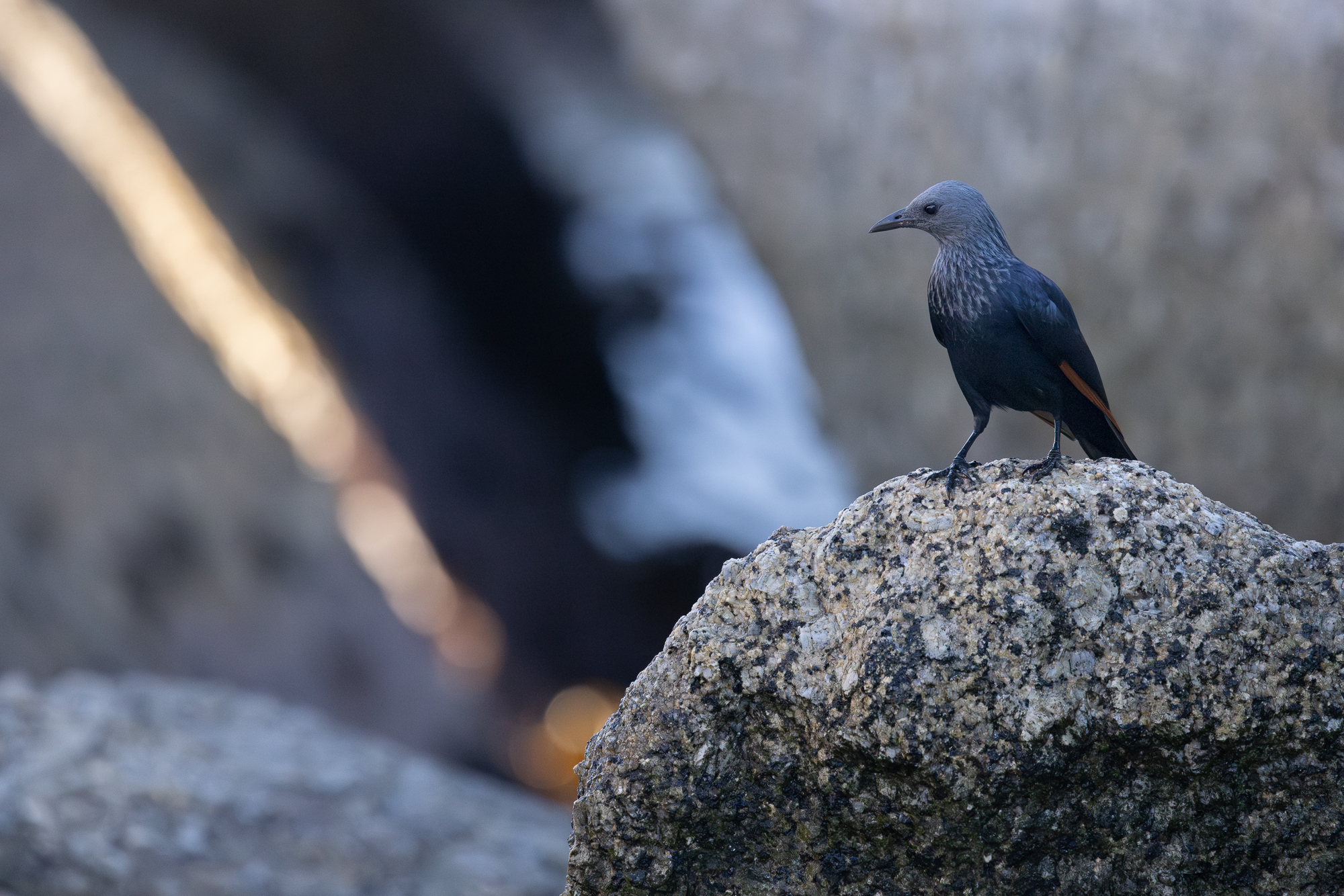
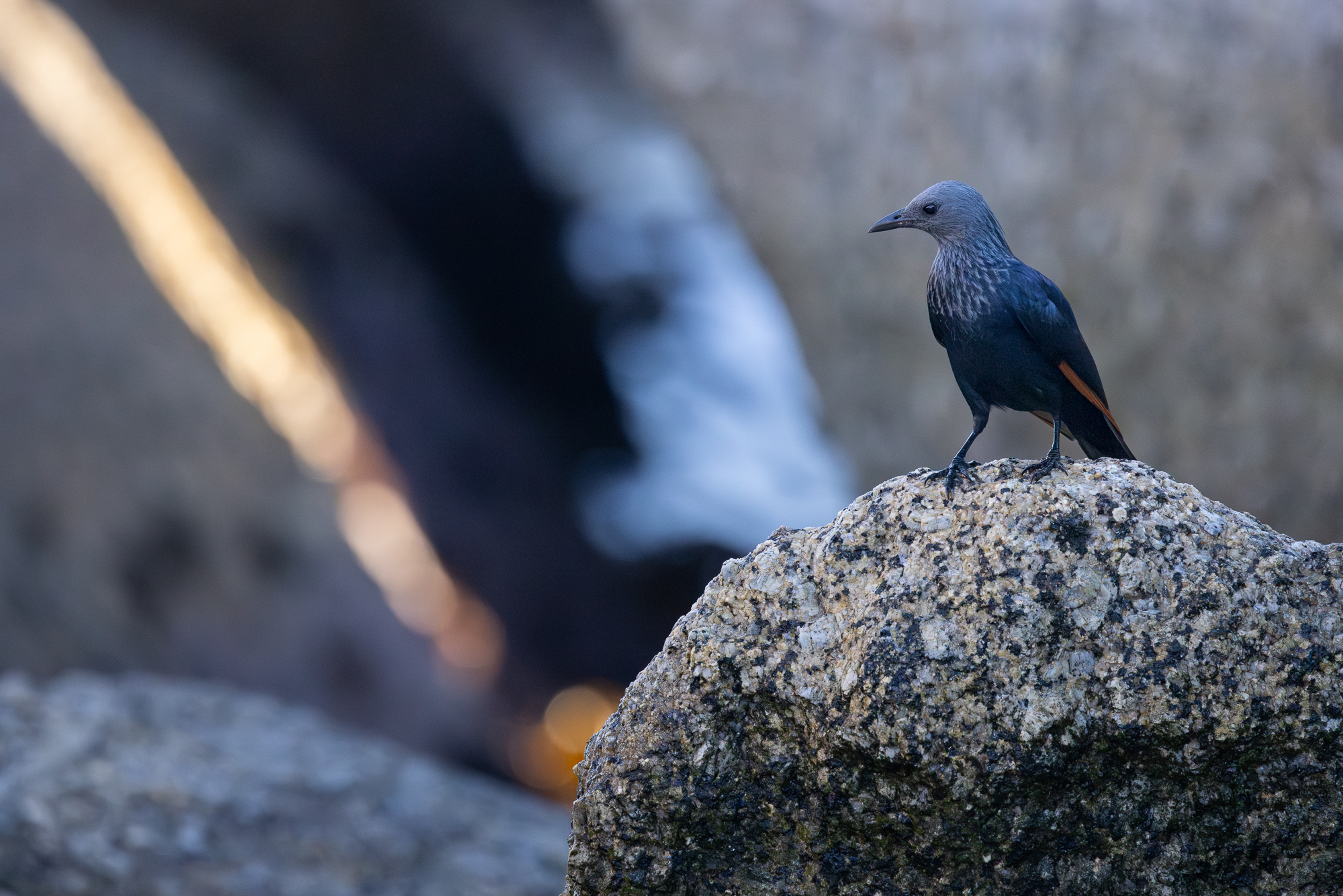
I took this picture of a female Red-winged Starling early one morning on a beach where my partner and I were photographing penguins. As I look at the photo, I ask myself:
- In what way is this picture like and unlike what I remember?
- Are there changes that I can make to help the reader see and feel what I saw and felt?
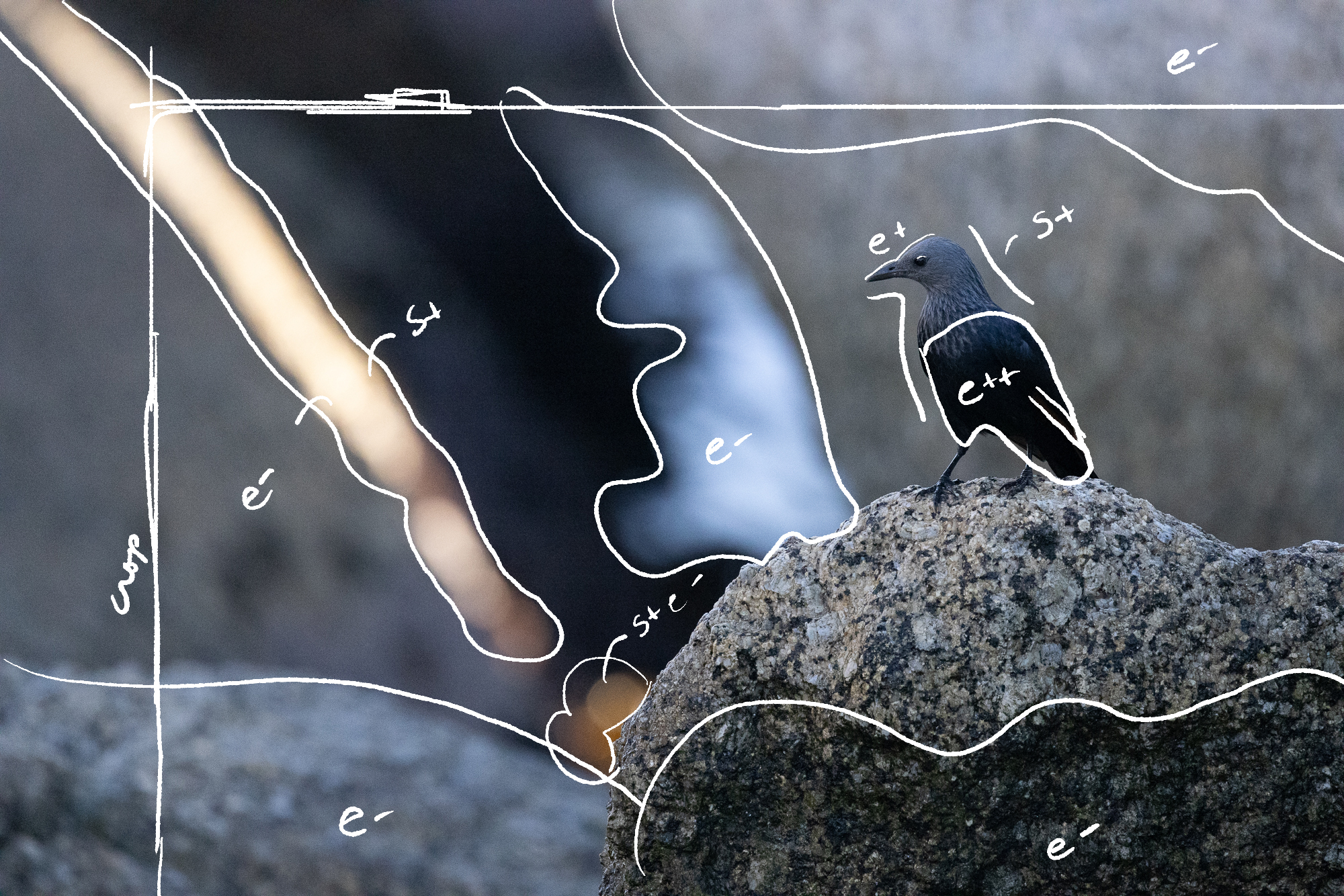
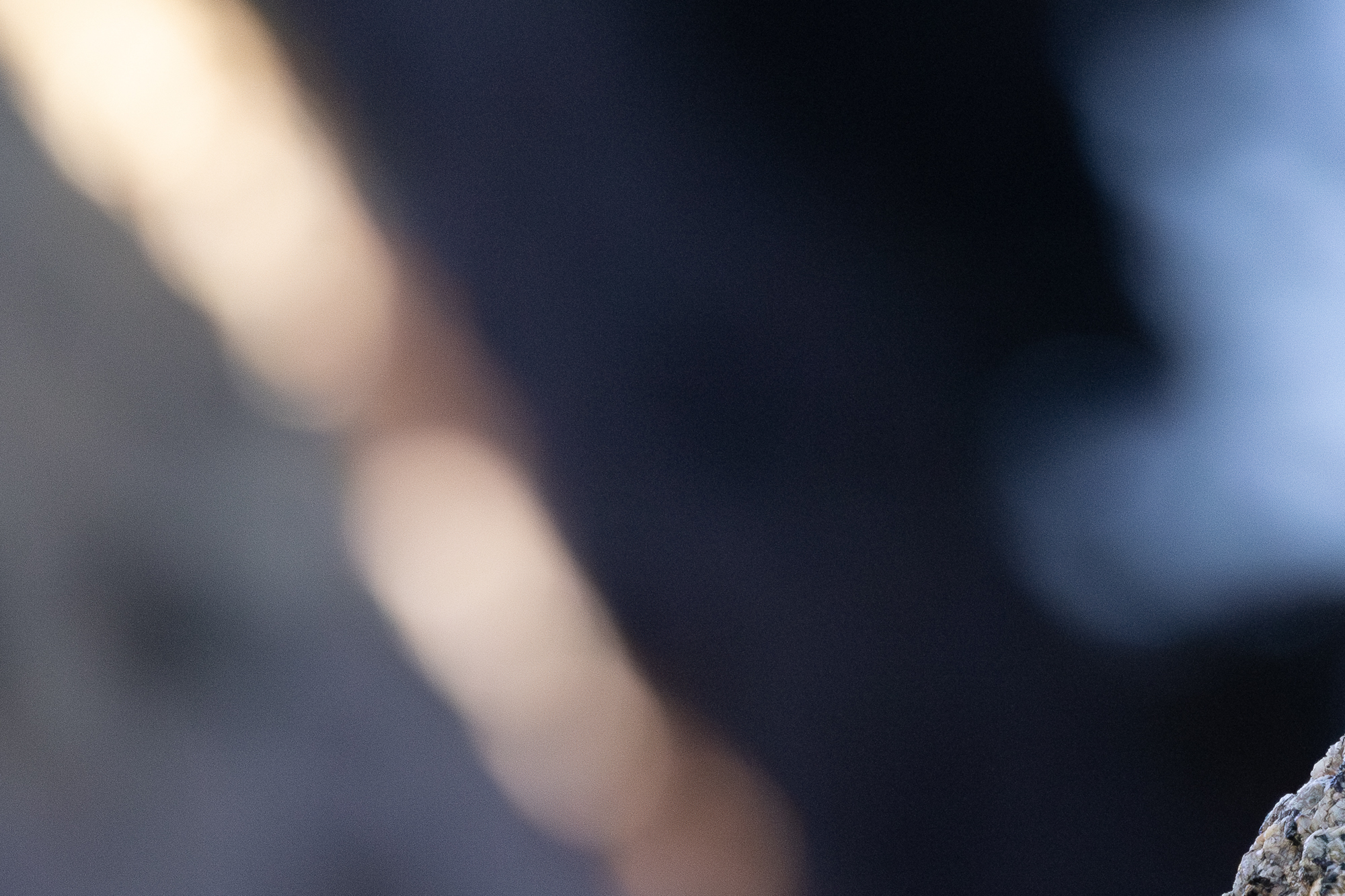
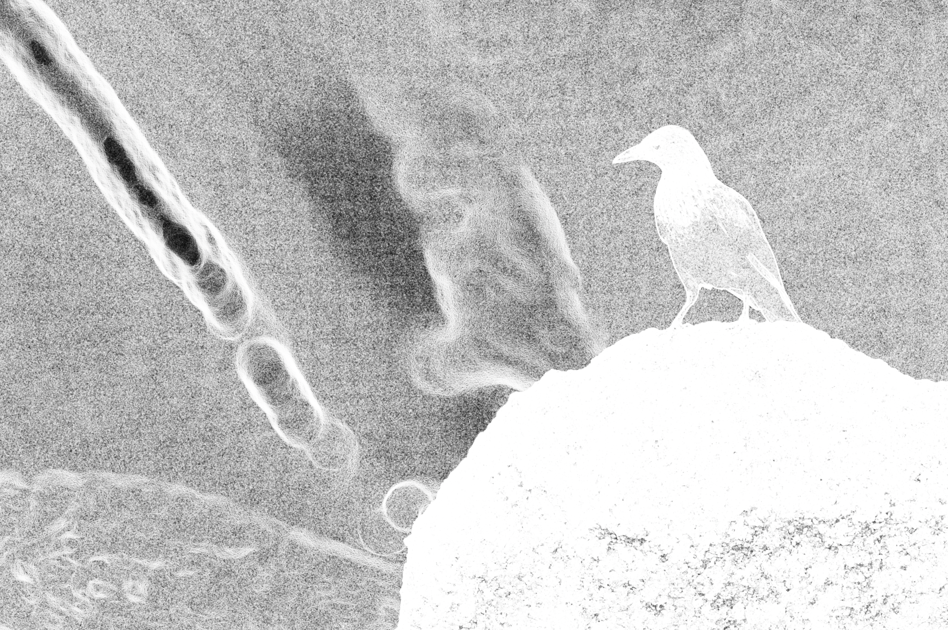
It might even help to mark up your image. And look, no one needs to mark up their image, but I find that it helps me think about my picture. Here, I mark a few things:
- Elements that are more prominent that my memory. I might lower the exposure to reduce their prominence (e-). These include some of the rocks and the waves in the middle.
- Elements that are less prominent that my memory. I might raise the exposure or saturation to elevate their prominence. (e+, s+). This includes the starling’s head, belly, and red wing feathers and the bokeh (blurred light) near the middle bottom. It also includes the long beam of light, which is overexposed to the point that it loses the color that drew my attention. It actually needs less exposure (e-).

3. Crop into the story.
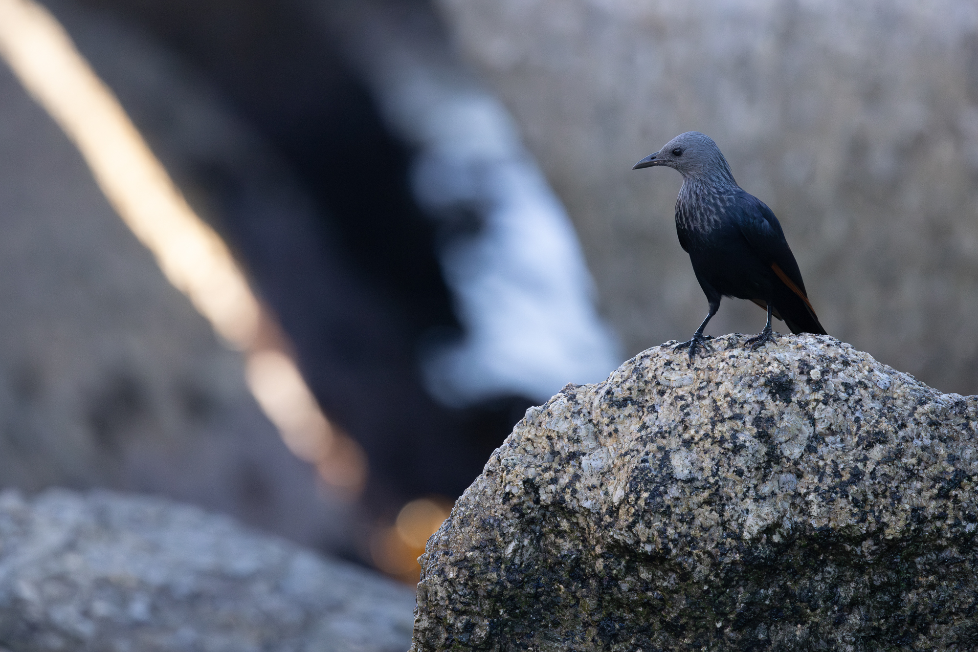
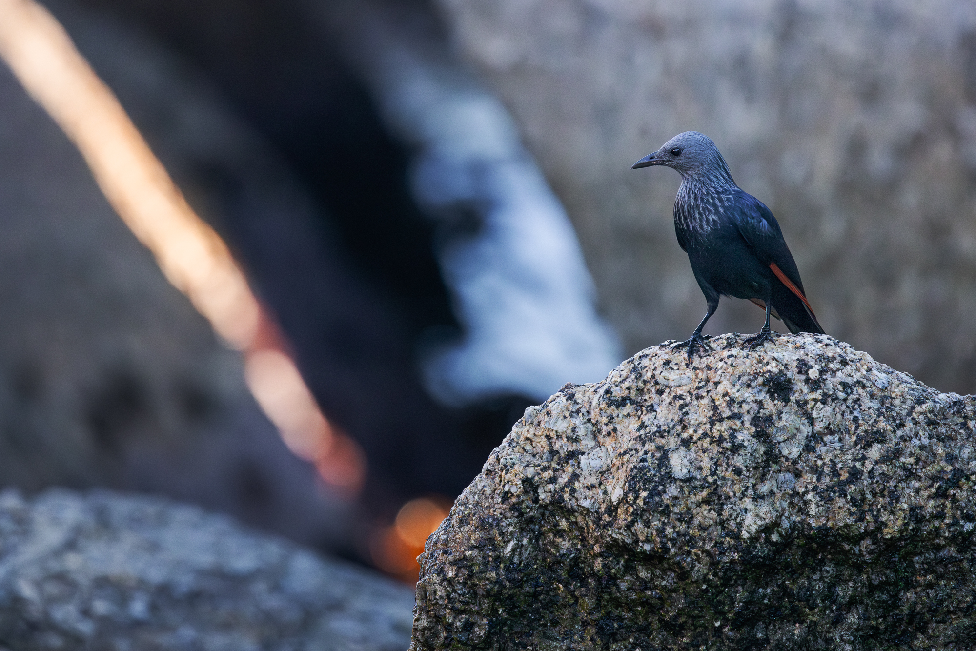
Before you do any other editing, crop the image to reveal the relationships you want to highlight. For me, the image is about the red of starling’s wing mirroring the red of the beam of light, so I crop in to get closer to these subjects.
4. Tidy up.
Before doing too much editing, clean up the exposure if it needs it.
My subject was in shadow, so my camera cranked up the ISO to compensate. (ISO is the brightness value that the camera assigned to light data captured by the sensor.) The higher this value, the more noise and aberration appears in the image. My ISO was at the top of its range, 12800.
I edit in Adobe Lightroom Classic, which has reasonably good denoising. I use denoising to eliminate some of the distracting noise, like the boxy pattern you can see in this image:

And the way the noise makes the background more a point of focus that it should, like this image:

Just don’t overdo it. Remove too much noise and your subjects will look wavy, like smudged oil pastel.
4. Paint with light.
With those initial steps complete, turn your focus to adjusting the color and exposure of the image to reveal the features you’ve identified as needing attention.
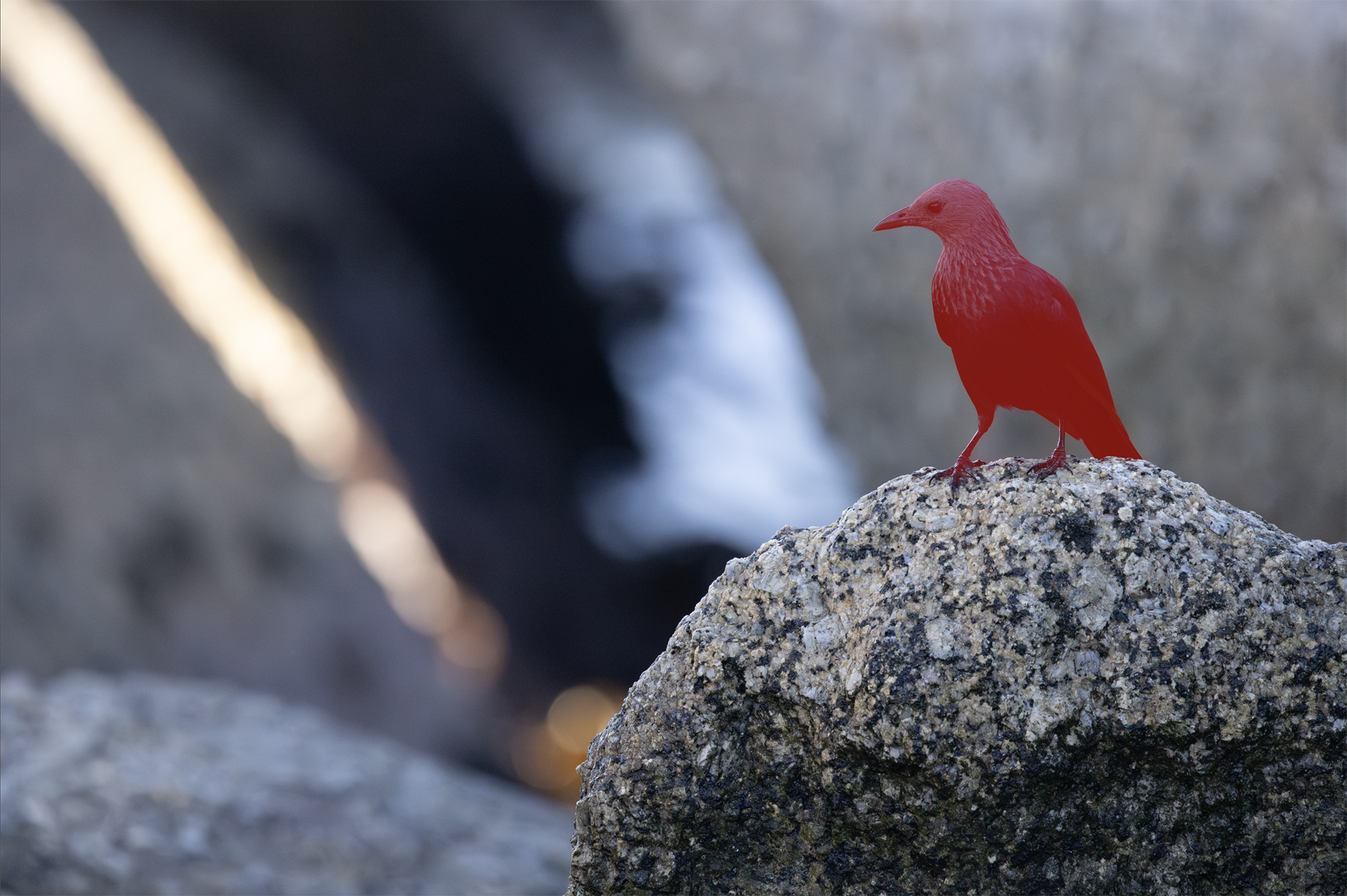
One of Lightroom’s most useful tools is masking, a brush you apply to isolate elements you want to edit without affecting other parts of the image. So, I use masking to isolate the subject I want to adjust, shown here in red:
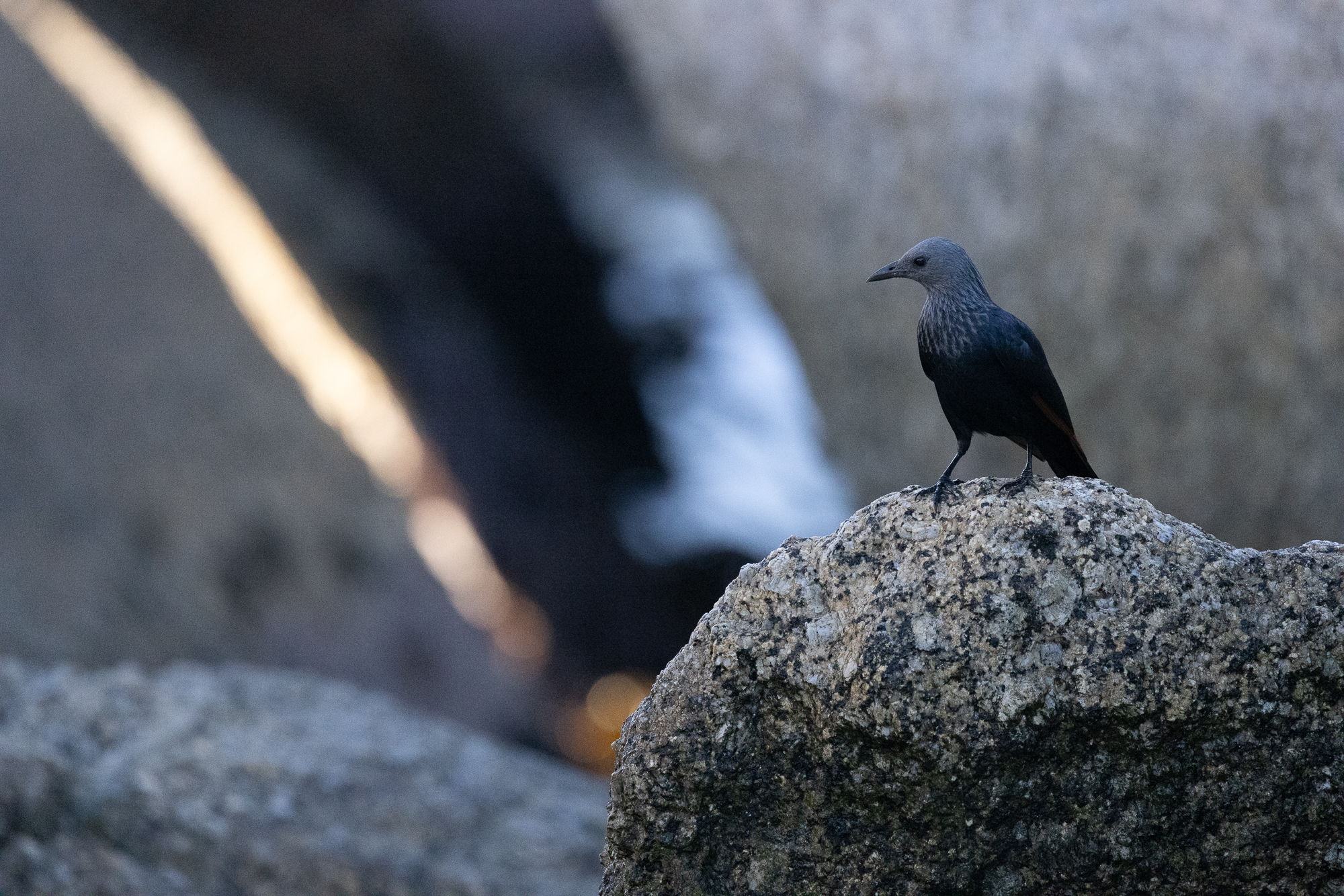
Here, I use Lightroom’s Shadows adjustment to recover data that my eye could see when I was shooting the scene but which look quite dark in my image. This is one reason to shoot RAW: compared to JPEG, RAW files tend to capture more data in the shadows and highlights.
The red of the starling’s wing is more prominent now, as is her glossy head, better matching my memory.
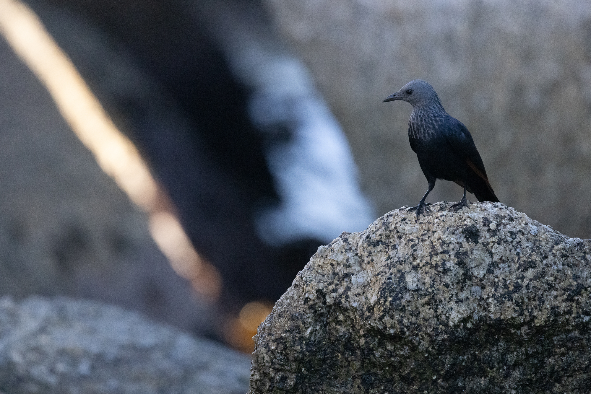
You can also make adjustments in the opposite direction, reducing the exposure of areas of the photo that are brighter than they should be. Here, I use the same masking process, but adjust the exposure down to reduce the prominence of the waves and to restore some of the color in the beam of light.

5. Don’t let your software work against you.
Somewhere in this process, check to ensure that your software’s sharpening settings aren’t working against you. Lightroom has a sharpening tool that allows users to decide how much of an image gets sharpened. Set its threshold low to sharp the whole frame. Set its threshold higher to only sharpen edges.
On the left, notice how Lightroom sharpens noise in areas I don’t want, emphasizing that boxy pattern. On the right, I restrict sharpening to the elements I want viewers to notice. The difference is subtle, but it’s there:

6. Choose the path of chaos.
Here’s the image I’ve created so far:
I like it. But I can’t help feeling it’s a bit less vivid or punchy than I want.
Look, this is where it gets personal. I grew up in an era when National Geographic magazines were full of images captured on film like Kodachrome 25 or 64. Those images were flawed, but beautiful in their flaws. Lots of grain, deep shadows, saturated colors, unexpected tints.
It’s not that I want to reintroduce flaws into my digital editing today. My goal is to edit for fidelity to the scene I saw. What I do miss is the tiny bit of chaos film introduced into the process. Sometimes you’d take a photo and find that something about the color or light was not what you expected due to a concatenation of environment and technology. It’s that glimmer of the unexpected that I miss, and so I recreate it in my workflow.
One of my favorite editing tools is DxO Filmpack, which emulates film. It’s not perfect; no digital tool reproduces film accurately, to be honest. But the software is well made, and I often pass my edited photos through it, using a Kodachrome 25 or 64 emulation, just to reintroduce a whisper of chaos. You have to live a little, you know?
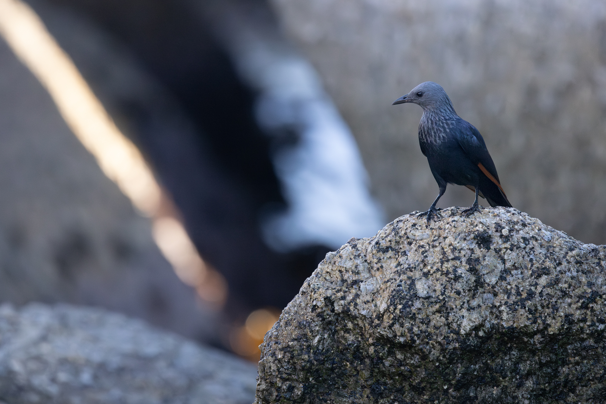
It’s not dramatic, but a few tiny and useful things have happened: the starling’s head pops a little more; there is now a fine coating of grain across the image—but filmlike grain, not boxy ISO noise; and the beam of light pops.
I’m pretty happy with this, and so—
7. Check your work.
Think you’re done? Compare your edit to the original and see how it looks.

In the first version of this tutorial, I got to my final image and, with sinking heart, realized I didn’t like my composition. Sometimes the editing process can run away with your attention until you’ve made something other than what you set out to create. And so I started over. It’s better to have that realization before you publish.
So, here we are at the final image, and I like it. It’s not only more like what I saw, but it offers a clearer and more focused story about the elements in the frame.
Of course, everyone is going to edit differently, which is why identifying your values and aims as a photo editor is important. That piece of the process chips away at a question that has been part of photography’s story since it burst onto the public scene in the 1840s: is photography an art or a science?
I can only answer: both. No matter how much you try, the camera never sees exactly what the human eye sees.
And no matter how much you try, the mind remembers the scene as the whole body experienced it.
Somewhere between the two is something like the truth. It’s a truth that must always be made.
